![LOGO GREY new [Recovered].png](https://static.wixstatic.com/media/4d921f_df385bb023bc43859a4de647c3cfcdc1~mv2.png/v1/crop/x_0,y_0,w_2390,h_3466/fill/w_177,h_255,al_c,q_85,usm_0.66_1.00_0.01,enc_avif,quality_auto/LOGO%20GREY%20new%20%5BRecovered%5D.png)

end-to-end design
Overview
Eureka, is a greek word that means "To have found something", used by scholar Archimedes, when he discovered how to measure irregular objects, and ran shouting that word through the streets of Syracuse. It's also the motto of California, referring to the discovery of gold since 1848.
Eureka is the digital version of a lost & found box, where people can search for the wallet they left behind on the train, the laptop they forgot at a cafe, or also, to look for the owner of a missing item they found.
Eureka had been an idea I'd had for a few months now. Since I've lost a considerable amount of items during the years, it was until I had the opportunity to work on this project that I could validate and develop my concept through research, ideation and implementation
Eureka's principle is simplicity and safety. The process to exchange items is smooth, and guaranteeing a safe exchange between users is our priority.
Duration of the project: 80 hours
My role in this project: UX/ UI, research, ideation, branding, illustration, testing
Tools used: Adobe Illustrator, Figma, Maze, Figjam
Design Process
1
Ideate & Research
• Ideation of concept
• Market research/ competitive analysis
• Secondary research
• Research synthesis
• Interviews
• Persona development
2
Defining & Interaction design
• User flows
• Feature roadmap
• Sketching
• testing & iteration
Branding & User interface design
• Branding
• Illustration
• Patterns & icons
3
Testing & implementation
• Testing through Maze prototypes and on zoom calls
• Iteration
• Implementation
4
1/IDEATE & RESEARCH
The concept was inspired by lost & found boxes, like the ones you find at restaurants and libraries where they keep thing you forgot. My first step was to research if there was something like it on digital format, like websites or apps, which I was not able to find (at least that has this same format)
When doing secondary research, I found simple data and statistics that actually helped me shape the final project
Most common items lost or misplaced
US: phones, car & house keys, glasses, wallets and bags
UK: Keys, phone, pens (or other items of stationery), glasses or sunglasses,
• Other items commonly misplaced and lost (of relevance to this project): phone charger, bank cards, gloves, umbrella, headphones or AirPods, watches and hats.
• Americans lose an average of $5,591 over a lifetime
• A survey of 1,000 U.S. adults by Bluetooth tracking company Pebblebee.com reveals that one in five loses or misplaces personal belongings every week
• Car keys top the list of the most common items lost
In spite of this, there is not a platform for day to day users search for missing items or let other people know when they have found items. I did find 3 apps, which were very low quality prototypes, and not really usable, other than the "missing pet" apps and the lost & found section on Craigslist.
Also, airline and airport websites were an indirect competitor. These usually have warehouses where they store missing items for up to 90 days. LAX, the second-busiest airport in the United States, receives an average of 5,000 to 7,000 items each month at the airport’s Lost and Found office.
Third, there are softwares made by tech companies that are meant to be business to business. They are inventory management softwares, that cater to private companies like festivals, and concert organizers, so these can manage items lost on premises during their events. These softwares, such as 24/7 software although they serve a similar purpose to Eureka, are b2b only. Although this may even be the next step for Eureka!
Overall takeaways and desirable features gathered from these indirect competitors:
-
Users can file claim forms
-
Admins are able to match the information with their inventory (verifying questions to legitimate its owner)
-
Location and time specifics are essential to this process
-
Integrated shipping feature where the owner of the found item can pay for shipping, and track it.
-
If there is any pictures, the ability to upload them
This list of desirable features later would be the base for the feature roadmap!
User interviews
Takeaways:
• Goals:
To understand behavior and motivations (when losing or returning lost items) There is not a lot of explored territory, as there are no direct competitors to this.
• Focus
Why would the user keep this app on their phone other than when they lose something?
Are users strictly motivated to go out of their way to return only if there is a reward?
Security concerns from users when meeting strangers for an exchange
• Participants: 4, females, ages 21-32
• All participants agreed that they might give money to a person returning their item, but would not expect any money in return.
• All participants prefer to meet at a public space for security.
• 3 out of 4 agreed they would feel safer, if they could use a location tracking feature, where they could mark themselves as safe after exchanging the item.
• Participants would call the police and check at local banks for physical lost cards and even wallets. Maybe a feature to do a police report or the number for the bank to cancel the debit or credit cards would be a “nice to have” feature.
• A description of the item is important for users to feel like they're returning the item to the correct person, although it’s not essential.
Extrovert
Sensing
Thinking
Judging
maura o'brian- user persona

Age: 27
Gender: Female
Income: 72k a year
Maura was diagnosed with ADHD when she was 11 years old. She is always losing items on the go. To this day, this year, she has already lost a wallet (that she found since someone turned it to the police), an umbrella, and a debit card. She also has a lot of empathy when she finds lost items on the street since she knows how streesful it is to lose your belongings. She is an honest person that would definitely returned an item if she knew how to
“It’s hard living with ADHD and losing stuff all the time”
Personality:
Introvert
Intuition
Feeling
Perceiving
Painpoints
• People not returning items they find
• Leaving things behind by accident
• Not knowing where to meet a strange person when an item exchange is needed
Goals
•To help people find items they lost whenever she has found them
• To get her lost items back at least most of the times
Location: New York
Occupation: Actress
Marital Status: Single
2/Define & interaction design
Having the data provided by the research, interviews and user persona, the process to define the features needed (with the help of a user flow as a guide) was easy and smooth.
It is important to note that Eureka has two parallel user flows, that are similar but there are differences particular to each one. However, this simplified the design process, as it was more efficient to later design around two almost identical flows, and mirroring every screen. This saved a lot of time, gives consistency to the app, and creates familiarity for the users. It goes as follows:
• It starts by asking the user if they lost or found an item.
• Asks the user to specify item, and describe it
• Asks the user to check for other items in the area where the item they are reporting was lost or found
• If they find it, it coordinates a meeting between the two parties (the person who lost the item and the person who found it, or vice versa)
Lost
found

The sketching followed this flow, one landing page that splits into two and follow along in parallel. Below are the second low fidelity wireframes, after the first round of testing; which concluded:
• The prototype needed two visible buttons at most times to switch between lost items and found items if the user needed to
• An alert had to be visible at all times, because of the sense or urgency some users experience while hoping to get a lost item back. In case it was found, they wanted to know ASAP.

3/Branding & UI design
The Eureka logo features a box in purple flames. The basic idea a lost & found carton, which was the main inspiration for this product, and purple because it can calm or soothe a viewer, in this case, lowering the anxiety of missing a beloved item. Logo was purchased on BrandCrowd, due to time constraints*

![LOGO GREY new [Recovered].png](https://static.wixstatic.com/media/4d921f_df385bb023bc43859a4de647c3cfcdc1~mv2.png/v1/crop/x_0,y_0,w_2390,h_3505/fill/w_170,h_249,al_c,q_85,usm_0.66_1.00_0.01,enc_avif,quality_auto/LOGO%20GREY%20new%20%5BRecovered%5D.png)
• Typeface: Roboto
24x headers
16x text
11x text under icons
9x Time Stamps
• UX KIT: (Provided by Icons8 on their Figma plugin, since their library is vast and complete and for consistency

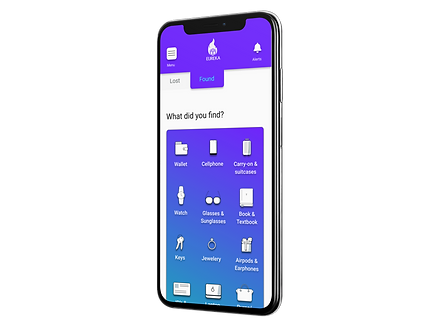
• Illustrations made on Adobe Illustrator by me to have consistency between all of them. Because there were too many elements that could be distracting, I kept the illustrations simple, in black, white and light blue #BDCCD4.
After usability testing of the hi fi prototype, I changed the white background on these illustrations to a gradient using Eureka's main colors; the black text to white text, and added a drop shadow to pop them up, increasing contrast and improving accessibility
TAP HERE
• CTAs: Corners with a 7 radius (px)
• Colors used:
#6415FF (Main screen, header, footer, CTAs)
#17FBED (Highlights)

4/testing & implementation
Methodologies: User observation & interviews
First testing (before branding):
Goals: To test and validate main user flows
Iterations:
• Added verifying questions
• Drop down menus instead of type boxes
• Added tabs so the user could swap between lost or found items.
Also, on the first round of usability testing on the high fidelity wireframes:
• 68% of users completed both flows (combined) without any indirect clicks (outside of the task specified), with 90% success rate on the second flow, after some familiarity with the process.
• Sending a message to another user after confirming an item was 50% successful
Final testing:
After branding was completed*
Participants:
• 12 virtual participants on Maze, 2 live participants on zoom
Flow added and tested at this stage: Sending a message to another user after item has been confirmed
Final iterations:
• The alert button is separate from the menu, as many users pointed that, in case they need to be alert for a missing item, they need a button available at all times (To check for possible notifications that their item was found)
• Confusion caused by the phrase "review other items in the area", which users correlated to leaving a review to an item, changed after swapping "Review" for "See"
• Also, due to security concerns, users can only message other users after an item has been confirmed for both parties. Because of this, there is not a "messaging" section on the app. After confirming the item, users can message each other on a chat window on that item page, similar to Lyft or Uber, when you can message your driver while the transaction is happening.
To improve this particular experience, I labeled the buttons for alerts and menu. I put a message during the confirmation stage that lets users know they can contact the person in case they need to under Menu> my lost (or found) items.
• Menu was changed to include the user name, photo, and a contact us button, on an overlay that is placed left, that moved in and out when clicked outside.
.png)

.png)
%20copy.png)
%20copy%202.png)
.png)
Reflection and next steps
Making this was a great learning experience. I explored different way to come up with design systems, creating elements and components; improved prototyping skills, and user centric thinking.
For next steps, I would:
• Add a step to verify users to provide extra security
• Research other possible alternatives to sorting other than area, and type of item, when browsing lost or found items
• Add the feature to file a report for missing cards. Even tho a user mentioned during the interviews that she did not immediately cancel her credit cards when she lost her wallet, hoping to find them, which she did, some users would find it useful as well to have a button to call directly their banks to cancel and replace debit or credit cards.